---
description: Learn how to use the Directus UI components in your app extensions.
contributors: Esther Agbaje
---
# Using Directus UI Components
Directus provides a set of reusable UI components that can be used when building extensions. These components are used
by Directus itself, and are designed to provide a consistent user experience across different parts of the Directus Data
Studio.
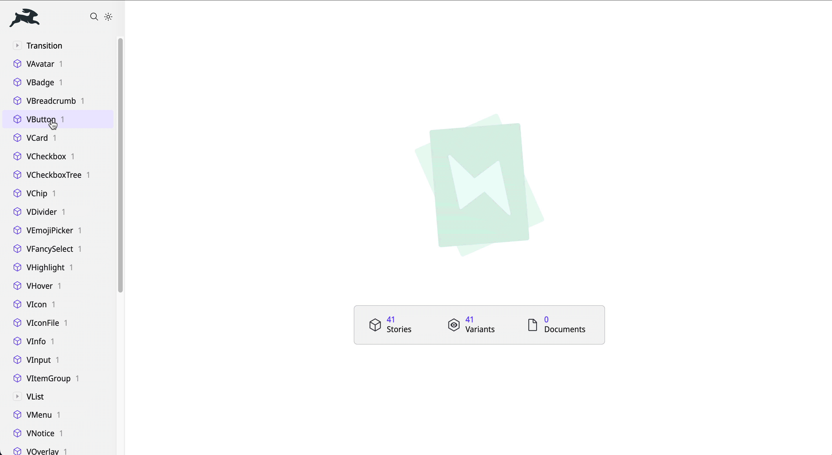
## Components Playground
Explore the available components in our [Directus Components Playground](https://components.directus.io/). Here, you can
see all available components and experiment with variations before implementing them in your extensions.
## Extension Usage
Directus UI components are globally registered, making them accessible throughout your extension project without the
need for explicit imports. Here’s an example:
```vue
My Button
```
## Customizing Styles
Each component exports CSS custom properties (variables) that can be targeted for style overrides.
For example, to adjust the text color of a button on hover:
```vue
My Button
```
::: tip Explore Component CSS Variables
Refer to the full list of component based CSS variables
[in our codebase](https://github.com/directus/directus/tree/main/app/src/components).
:::
## Creating a Custom UI Component
The Directus UI components are designed with flexibility and customization in mind. However, you may need to create your
own components using shared styling. Directus exposes several CSS variables for both light and dark themes.
Examples of CSS variables include `--border-normal`, `--foreground-normal` `-purple`, `--module-background`, and
`--overlay-color`.
::: tip Explore Light and Dark Theme CSS Variables
Refer to our [codebase](https://github.com/directus/directus/tree/main/app/src/styles/themes) for a full list of CSS
variables.
:::