mirror of
https://github.com/directus/directus.git
synced 2026-02-18 10:11:47 -05:00
 e47502e11f
* add logic to create parent collection before apply

* recursively create collection

* Recursively delete collection

* cleanup

* fix import

Co-authored-by: Azri Kahar <42867097+azrikahar@users.noreply.github.com>

* fix deconstruction of collections

Co-authored-by: Azri Kahar <42867097+azrikahar@users.noreply.github.com>

* fix deconstruction of collections

Co-authored-by: Azri Kahar <42867097+azrikahar@users.noreply.github.com>

* Fix destructing

* Move type declaration to the top

As requested during code review https://github.com/directus/directus/pull/12198#discussion_r857330627

* remove unnecessary empty array check.

* remove redundant map functions

* replace lodash functions in favor of built-in ones

* tweaks

* organize imports

Co-authored-by: Azri Kahar <42867097+azrikahar@users.noreply.github.com>
Co-authored-by: Stephan Schmitz <eyecatchup@gmail.com>
268 lines
12 KiB
Markdown
268 lines
12 KiB
Markdown
# Layouts
|
|
|
|
> Layouts are customized displays for viewing and interacting with the Items in a Collection. This makes working with
|
|
> some general category of data model, such as map locations or calendar events, a more human-friendly experience.
|
|
|
|
[[toc]]
|
|
|
|
## What's a Layout?
|
|
|
|
<video autoplay muted loop controls title="Layouts Montage">
|
|
<source src="https://cdn.directus.io/docs/v9/app-guide/layouts/layouts-20220415A/layouts-montage-20220419A.mp4" type="video/mp4" />
|
|
</video>
|
|
|
|
Data models vary drastically in shape and purpose, from eCommerce platforms to IoT fleets and everything in between.
|
|
While your Directus Project data may be stored in Collections _(i.e. SQL data tables)_, this table representation is not
|
|
always the most human-friendly way to interact with information. Layouts provide more human-friendly, intuitive displays
|
|
to view and interact with Items in a Collection.
|
|
|
|
The following sections detail the Layouts managed and supported by the Directus Team. Keep in mind that Directus is
|
|
open-source, modular and extensible. You are free to create any Layout you need on self-hosted and Enterprise Cloud
|
|
Projects. Additionally, Directus Cloud is always adding more Layouts to its
|
|
[Cloud Exclusive Extensions](/cloud/glossary/#extensions), so check back often to stay up-to-date with the latest and
|
|
greatest. Additionally, you can join the community on [Discord](https://discord.com/invite/directus) and
|
|
[GitHub](https://github.com/directus/directus/discussions) to find thousands of engineers guiding development of the
|
|
Directus platform.
|
|
|
|
## How it Works
|
|
|
|
<video autoplay muted loop controls title="Adjust Item Layouts">
|
|
<source src="https://cdn.directus.io/docs/v9/app-guide/layouts/layouts-20220415A/adjust-page-layout-20220415A.mp4" type="video/mp4" />
|
|
</video>
|
|
|
|
To adjust an Item's Layout, follow the steps below.
|
|
|
|
1. Navigate to the Content Module and select the desired Collection.
|
|
2. In the page Sidebar, click **"Layout Options"**.
|
|
3. Choose the desired Layout you want to use.
|
|
4. Customize the Layout as desired.
|
|
|
|
### Customization Controls
|
|
|
|
Customization controls can be found in the following three locations.
|
|
|
|
- **Layout Options** — Located in the Sidebar.
|
|
- **Subheader** — Located just below the Page Header and above the Page Area.
|
|
- **Page Area** — The center of the webpage, which displays all Items.
|
|
|
|
These controls typically fall into three general categories.
|
|
|
|
- **Styling and Formatting**\
|
|
These are additional customizations to the way a Layout displays such as the size of each Item, how images are cropped,
|
|
etc.
|
|
|
|
- **Field Values Displayed**\
|
|
Most Layouts allow you to choose which Field Value(s) are used to represent each Item on the Collection Page. For example,
|
|
with blog posts, it may be ideal to have the hero image, blog title, date, author, etc.
|
|
|
|
- **Manual and Automatic Sorting**\
|
|
Certain Layouts may allow sorting Items by value in ascending and descending order, drag-and-drop repositioning of Items,
|
|
etc.
|
|
|
|
### Key Takeaways
|
|
|
|
As you go through Layouts, it may be helpful to keep the following points in mind.
|
|
|
|
- **Layouts will not be universally usable for all Collections.**\
|
|
Layouts are tailored to work with specific data-models. For example, in order to work properly, the Map Layout requires
|
|
the Collection have a Map Field configured and the Calendar Layout requires the Collection have a datetime Field configured.
|
|
|
|
- **Controls are different for each Layout.**\
|
|
Each Layout presents data differently, so certain customizations may not be functional with certain Layouts. For example,
|
|
the Map Layout displays each Item as a pin on a map, so this Layout has no controls for sorting.
|
|
|
|
- **Controls for a Layout may be in different locations.**\
|
|
Depending on the Layout, the same control may be under Layout Options in the sidebar, the subheader, or on the Page Area
|
|
_(and Items themselves)_. For example, the Table Layout lets you set the Field Values displayed in the subheader while
|
|
the Card Layout lets you set Field Values displayed in the Layout Options menu.
|
|
|
|
## Table Layout
|
|
|
|

|
|
|
|
This Layout supports all forms of data, as it directly reflects how data is stored in a Collection. This is the default
|
|
Layout used in the Content Module. It includes the following controls.
|
|
|
|
**Layout Options**
|
|
|
|
- **Spacing** — Adjust the vertical space a row takes up.
|
|
|
|
**Subheader**
|
|
|
|
- **Adjust Column Width** — Click and drag the column divider to resize as desired.
|
|
- **Add Field** — Select <span mi icon>add</span> in the page subheader and select the desired Field(s).
|
|
- **Remove Field** — Select <span mi icon>arrow_drop_down</span> in the column title and click **"Hide Field"**.
|
|
- **Sort Items by Column** — Select <span mi icon>arrow_drop_down</span> in the column title and sort ascending or
|
|
descending.
|
|
- **Set Text Alignment** — Select <span mi icon>arrow_drop_down</span> in the column title and set left, right, or
|
|
center.
|
|
- **Toggle & Reorder Columns** — Click the column header, then drag-and-drop as desired.
|
|
- **Select All** — Click <span mi icon>check_box_outline_blank</span> in the selection column header.
|
|
|
|
**Page Area**
|
|
|
|
- **Select Item(s)** — Click <span mi icon>check_box_outline_blank</span> in the selection column for the desired
|
|
Item(s).
|
|
- **Manually Sort Items** — Toggle <span mi icon>sort</span> in the configured Sort column to drag and drop
|
|
<span mi icon>drag_handle</span> Items.
|
|
|
|
::: warning Manual Sorting Requires Configuration
|
|
|
|
Only available if a Sort column has been configured in the Collection's Data Model Settings.
|
|
|
|
<!--
|
|
@TODO configuration > data-model
|
|
Link
|
|
-->
|
|
|
|
:::
|
|
|
|
## Card Layout
|
|
|
|
|
|
|
|
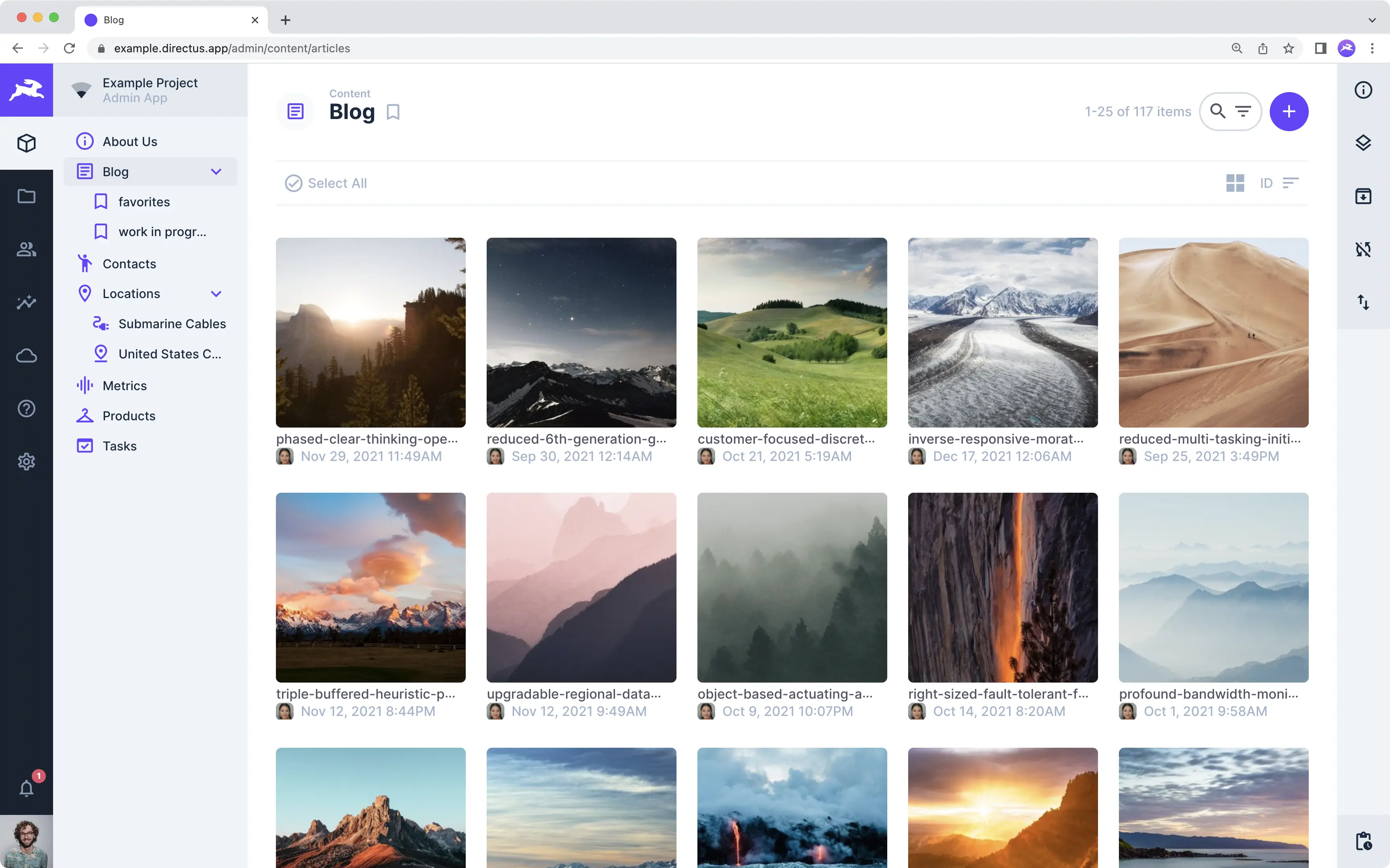
This tiled Layout is ideal for Collections that prioritize an image _(e.g. a user or blog post)_. This is the default
|
|
for both the [User Directory](/app/user-directory/) and [File Library](/app/file-library/). It includes the following
|
|
controls.
|
|
|
|
**Layout Options**
|
|
|
|
- **Image Source** — Set the Field used as the display image.
|
|
- **Title** — Set a mix of Field values and text to use as a title.
|
|
- **Subtitle** — Set a mix of Field values and text to use as a subtitle.
|
|
- **Image Fit** — Set how an image fits inside the Card.
|
|
- **Fallback Icon** — Set a default icon to display when an Item has no image.
|
|
|
|
**Subheader**
|
|
|
|
- **Card Size** — Toggle the Card size as it appears in the Page Area.
|
|
- **Sort Field** — Click to select the Field you wish to sort by from the dropdown menu.
|
|
- **Sort Direction** — Toggle ascending and descending sort directions.
|
|
- **Select All** — Click **"<span mi icon>check_circle</span> Select All"** in the selection column header.
|
|
|
|
**Page Area**
|
|
|
|
- **Select Item(s)** — Click <span mi icon>radio_button_unchecked</span> in the selection column for the desired
|
|
Item(s).
|
|
- **Adjust Time** — Click and drag an Item to change its time.
|
|
|
|
## Calendar Layout
|
|
|
|
|
|
|
|
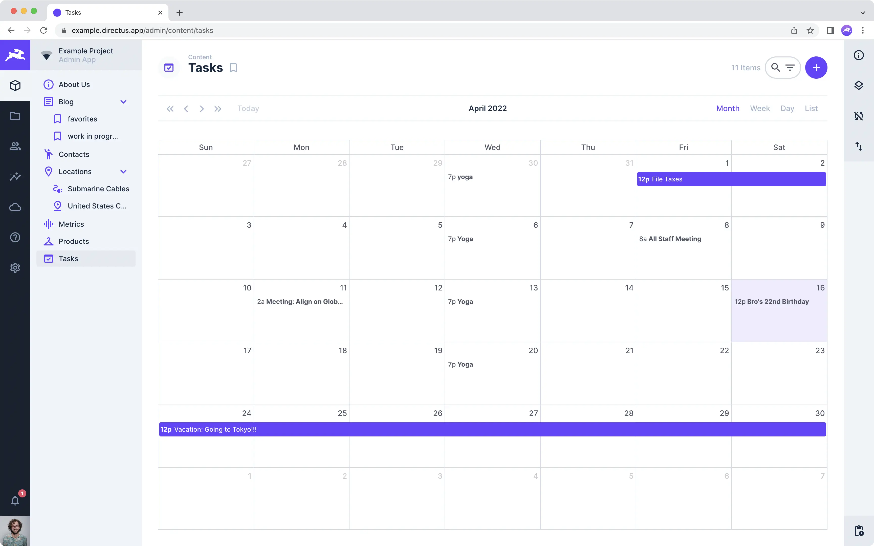
This Layout is ideal for Collections with time-oriented data _(e.g. events and appointments)_. It includes the following
|
|
controls.
|
|
|
|
**Layout Options**
|
|
|
|
- **Display Template** — Set a mix of Field values and text to represent Items on the calendar.
|
|
- **Start Date Field** — Choose Field to determine each Item's beginning time on the calendar.
|
|
- **End Date Field** — Choose Field to determine each Item's ending time on the calendar.
|
|
|
|
**Subheader**
|
|
|
|
- **Toggle Month and Year** — Move across time using the chevrons in the subheader.
|
|
- **Today** — Click to jump to the current date on the calendar.
|
|
- **Month Week Day List** — Adjust the time interval used to display Items in the Page Area.
|
|
|
|
**Page Area**
|
|
|
|
- **Select Item** — Click an Item on the calendar to open its Item Page.
|
|
|
|
:::tip Configuration Requirements
|
|
|
|
To use this Layout, the Collection will need at least one datetime Field to set a start time, but ideally two _(to set a
|
|
start and end time)_.
|
|
|
|
<!--
|
|
@TODO Config > Fields
|
|
Link to Datetime Field
|
|
-->
|
|
|
|
:::
|
|
|
|
## Map Layout
|
|
|
|

|
|
|
|
This Layout is ideal for Collections that emphasize geospatial data. It provides a world map, with Items displayed as
|
|
points, lines, and other geometry. The following options are available:
|
|
|
|
**Layout Options**
|
|
|
|
- **Basemap** — Choose the map provider used for the Collection.
|
|
- **Geospatial Field** — Select the geospatial field type to display on screen:
|
|
- **Map JSON Point** — Supports latitude-longitude based, single-point locations.
|
|
- **Map Geometry** — Supports geometric areas such as lines and polygons.
|
|
- **Display Template** — Choose the Fields displayed when hovering over an Item on the map.
|
|
- **Cluster Nearby Data** — Toggle whether or not nearby Items get clustered into a single pin.
|
|
|
|
**Subheader**\
|
|
_There is no Subheader on the Map Layout._
|
|
|
|
**Page Area**
|
|
|
|
- **Zoom** — Click <span mi icon>add</span> and <span mi icon>remove</span> in the upper left hand corner of the Page
|
|
Area to zoom in and out.
|
|
- **Zoom to my Location** — Click <span mi icon>my_location</span> to zoom into your current location on the map.
|
|
- **Reframe** — Click the square in the upper left-hand corner to resize and reframe the map area.
|
|
- **Select Item** — Click a single Item to enter its Item Page.
|
|
- **Select Items** — Click and drag to select multiple Items at once, opening the Item Page.
|
|
|
|
:::tip Configuration Requirements
|
|
|
|
To use this Layout, the Collection must have a Map Field configured.
|
|
|
|
<!--
|
|
@TODO Config > Fields
|
|
Link to Map Field
|
|
-->
|
|
|
|
:::
|
|
|
|
## Kanban Layout [Cloud Exclusive]
|
|
|
|

|
|
|
|
This Layout is ideal for Collections that serve as project management tools or to-do lists, where each Item represents a
|
|
task, because it groups Items onto columns according to their status _(e.g. "Not Started", "In Progress", "Under
|
|
Review", "Complete", or any other status defined)_. The following controls are available.
|
|
|
|
**Layout Options**
|
|
|
|
- **Group By** — Select the Field used to define Item status. See below for details.
|
|
- **Card Title** — Choose a Field to serve as a title on each Item.
|
|
- **Card Text** — Choose a Field to display additional text on each Item.
|
|
|
|
**Layout Options > Advanced**
|
|
|
|
- **Card Tags** — Choose a Tag Field to be displayed on the Item.
|
|
- **Card Date** — Choose a Datetime Field to be displayed on each Item.
|
|
- **Card Image** — Choose an Image Field to be displayed on each Item.
|
|
- **Card Image Fit** — Toggle whether the image fit is cropped.
|
|
- **Card User** — Choose the User Created Field to display their avatar in the bottom right corner.
|
|
- **Show Ungrouped** — Toggle display of a column containing Items with no assigned status.
|
|
|
|
**Subheader**\
|
|
_There is no Subheader for the Kanban Layout._
|
|
|
|
**Page Area**
|
|
|
|
- **Create Task and Assign Status** — Click <span mi icon>add</span> in a status column and the Item Page will open.
|
|
- **Sort Panels** — Drag and drop Items to reposition or change task status.
|
|
- **Add Status Panel** — Click <span mi icon>add_box</span> and add a group name (i.e. new status column).
|
|
- **Edit or Delete Status Column** — Click <span mi icon>more_horiz</span> and then click <span mi icon>edit</span> to
|
|
edit or <span mi icon>delete</span> to delete.
|
|
|
|
:::tip Configuration Requirements
|
|
|
|
To make this Layout work, you will need to configure an appropriate status Field on the Collection, then identify this
|
|
Field under **"Group By"** in the Layout Options menu.
|
|
|
|
<!--
|
|
@TODO Config > Fields
|
|
Create and link to Kanban config tutorial.
|
|
-->
|
|
|
|
:::
|