mirror of
https://github.com/directus/directus.git
synced 2026-04-25 03:00:53 -04:00
 33259fd4c4
Co-authored-by: Kevin Lewis <kvn@lws.io>
Co-authored-by: Pascal Jufer <pascal-jufer@bluewin.ch>
73 lines
2.2 KiB
Markdown
73 lines
2.2 KiB
Markdown
---
|
||
description: Learn how to use the Directus UI components in your app extensions.
|
||
contributors: Esther Agbaje
|
||
---
|
||
|
||
# Using Directus UI Components
|
||
|
||
Directus provides a set of reusable UI components that can be used when building extensions. These components are used
|
||
by Directus itself, and are designed to provide a consistent user experience across different parts of the Directus Data
|
||
Studio.
|
||
|
||
## Components Playground
|
||
|
||
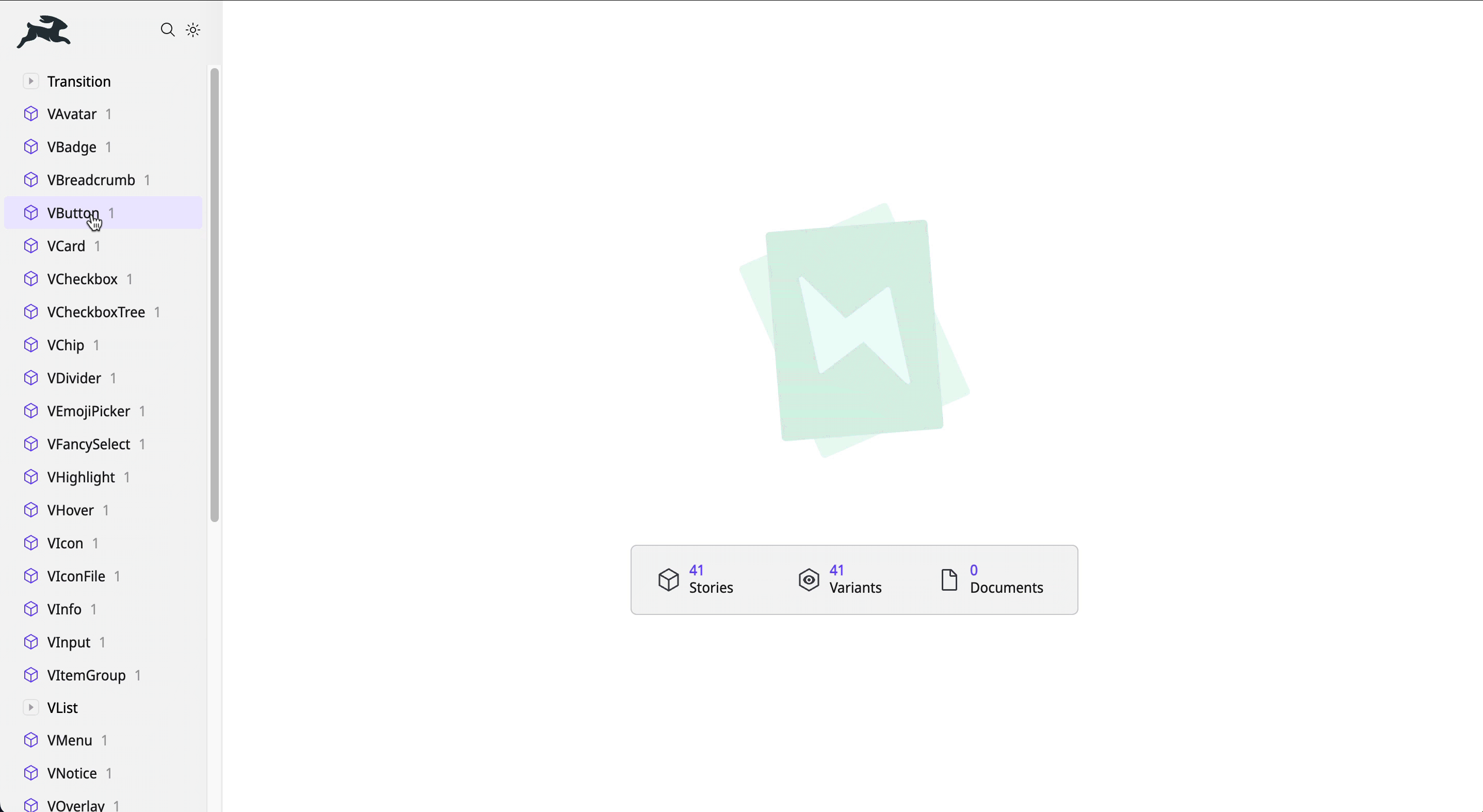
Explore the available components in our [Directus Components Playground](https://components.directus.io/). Here, you can
|
||
see all available components and experiment with variations before implementing them in your extensions.
|
||
|
||
|
||
|
||
## Extension Usage
|
||
|
||
Directus UI components are globally registered, making them accessible throughout your extension project without the
|
||
need for explicit imports. Here’s an example:
|
||
|
||
```vue
|
||
<VButton>
|
||
My Button
|
||
</VButton>
|
||
```
|
||
|
||
## Customizing Styles
|
||
|
||
Each component exports CSS custom properties (variables) that can be targeted for style overrides.
|
||
|
||
For example, to adjust the text color of a button on hover:
|
||
|
||
```vue
|
||
<template>
|
||
<!-- give the button a class -->
|
||
<VButton class="my-button">
|
||
My Button
|
||
</VButton>
|
||
</template>
|
||
|
||
<style>
|
||
/* customize the style */
|
||
.my-button {
|
||
--v-button-color-hover: black;
|
||
}
|
||
</style>
|
||
```
|
||
|
||
::: tip Explore Component CSS Variables
|
||
|
||
Refer to the full list of component based CSS variables
|
||
[in our codebase](https://github.com/directus/directus/tree/main/app/src/components).
|
||
|
||
:::
|
||
|
||
## Creating a Custom UI Component
|
||
|
||
The Directus UI components are designed with flexibility and customization in mind. However, you may need to create your
|
||
own components using shared styling. Directus exposes several CSS variables for both light and dark themes.
|
||
|
||
Examples of CSS variables include `--border-normal`, `--foreground-normal` `-purple`, `--module-background`, and
|
||
`--overlay-color`.
|
||
|
||
::: tip Explore Light and Dark Theme CSS Variables
|
||
|
||
Refer to our [codebase](https://github.com/directus/directus/tree/main/app/src/styles/themes) for a full list of CSS
|
||
variables.
|
||
|
||
:::
|